Why should video content be displayed on your website? In this blog post, we’re going to dive into why video content on your website is so important. And more importantly, how you can implement this aesthetic to your Showit pages.
If you’re completely new to Showit, try starting with this tutorial to get acquainted with the interface.
Why should you add videos to your Showit website?
As we all know, the world is moving toward short video content and as much as we love or hate it, it’s here to stay. Video has a way to build connection, grab the viewer’s attention and bring a magical aesthetic to your website.
I get a lot of compliments on my website, and I know it’s because of all of the moving elements. The GIFS, the full length wedding films, and the slideshow video carousel of some of my hero canvases on my Showit pages, are what makes my website GREAT.
We’re going to discuss how to add GIFS, short videos, and long videos to your website.
We will also discuss the STRATEGY behind these moving pieces and how to be intentional with your design.
This blog post will be most helpful for photographers and videographers who have video content ready to go. It will also help a lot to have your website built on Showit as this is what mine is on!
How to add GIFS to your Showit Website
I like to add gifs very intentionally on my website. I use them to show BTS shots of me in action on a wedding day, or I’ll turn the high burst photo I took with my couple into a GIF for my website.
For wedding photographers and videographers, GIFS have become a largely creative way of showing our work off on Instagram. I say to take this further and display them on your website.
To make a GIF from photos, check out my “How to Make a GIF tutorial on instagram.”
To make a GIF from videos (.mp4 or .mov), you can use EZgif to easily convert it.
Or, you use a “stop motion” effect onto your clips to give it that .GIF animation look before exporting.
First, make sure your GIF is in a .GIF format and is less than 10mb in size.
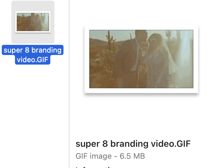
Second, upload your GIF into your media library by selecting these 3 buttons. Once your .GIF file is uploaded, it will show up in the library and you can select it with a blue check mark like so 👇


Third, don’t forget to add your branding colors and fonts around it so it spices it up even further! My website designer helped me with my branding kit and they built a great SEO optimized design for my website back in early 2021. Check them out here if you need help in that realm!
This is a recorded screenshot of where I placed these GIFS. Because it was a Super 8 GIF from a branding video, I strategically placed it in the Branding Videos Canvas where I have my contact form and a full length branding video.
How to strategically display GIFS on your website
I have a bunch of GIFS on my website and I use them strategically with my brand. Alesia Films is a very personal brand, it’s literally my name in my business. I’m promising that they’re getting Alesia in the flesh to imagine, plan, film and create a unique wedding video of the couple’s dreams. So I strategically decided that most of the GIFS on my website be me with a camera, me dancing with wedding couples, or be placed as design next to text of what I’m talking about (like in the example above).
My brand is also very travel and destination driven. Some other GIFS I have for strict aesthetic purposes is a simple orbital panning GIF of cactuses, palm trees, the beach, etc. I wanted these clips to be just slightly moving so it captures the eye and creates movement in every other canvas.
For you, I suggest thinking ahead about which media you want as GIFS and which media you want as videos. It’s an important decision that should align with your brand and what you want to book more of.
To get a full visual of my GIF designs, head to my Website here.
How to add short videos to your Showit website
Short videos are possible to display on Showit if they are less than 10mb in size. For reference, I have a 16 second video clip on my Blog page that I shot in 4k playing on a loop that you can check out here.
To make this, open up Final Cut Pro and put together a 10-15 second clip of the shots you want to display. Edit it as you normally would a wedding video or photo so it matches your brand design and website aesthetic.
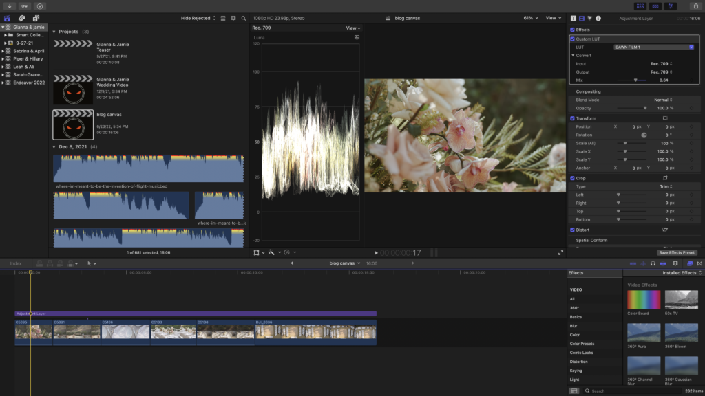
Then, export at 1080p.
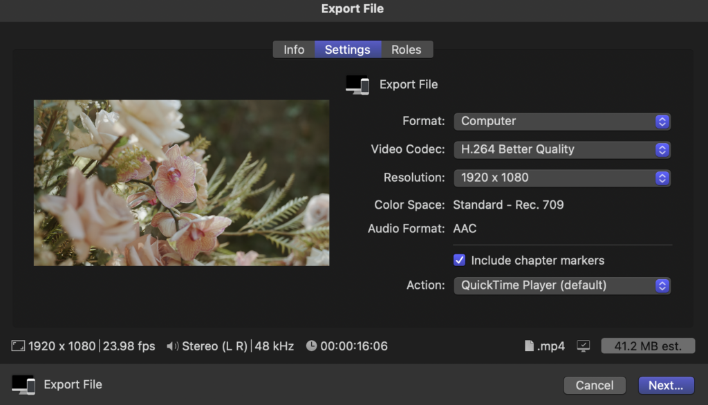
Notice how the file size is 41.2 mb?
You’ll need to download the tool Handbrake to make your video a small enough file size for Showit. It’s a video compressor that reduces the video file size while keeping the quality high. You only need to use this if your video is over 10mb in file size.

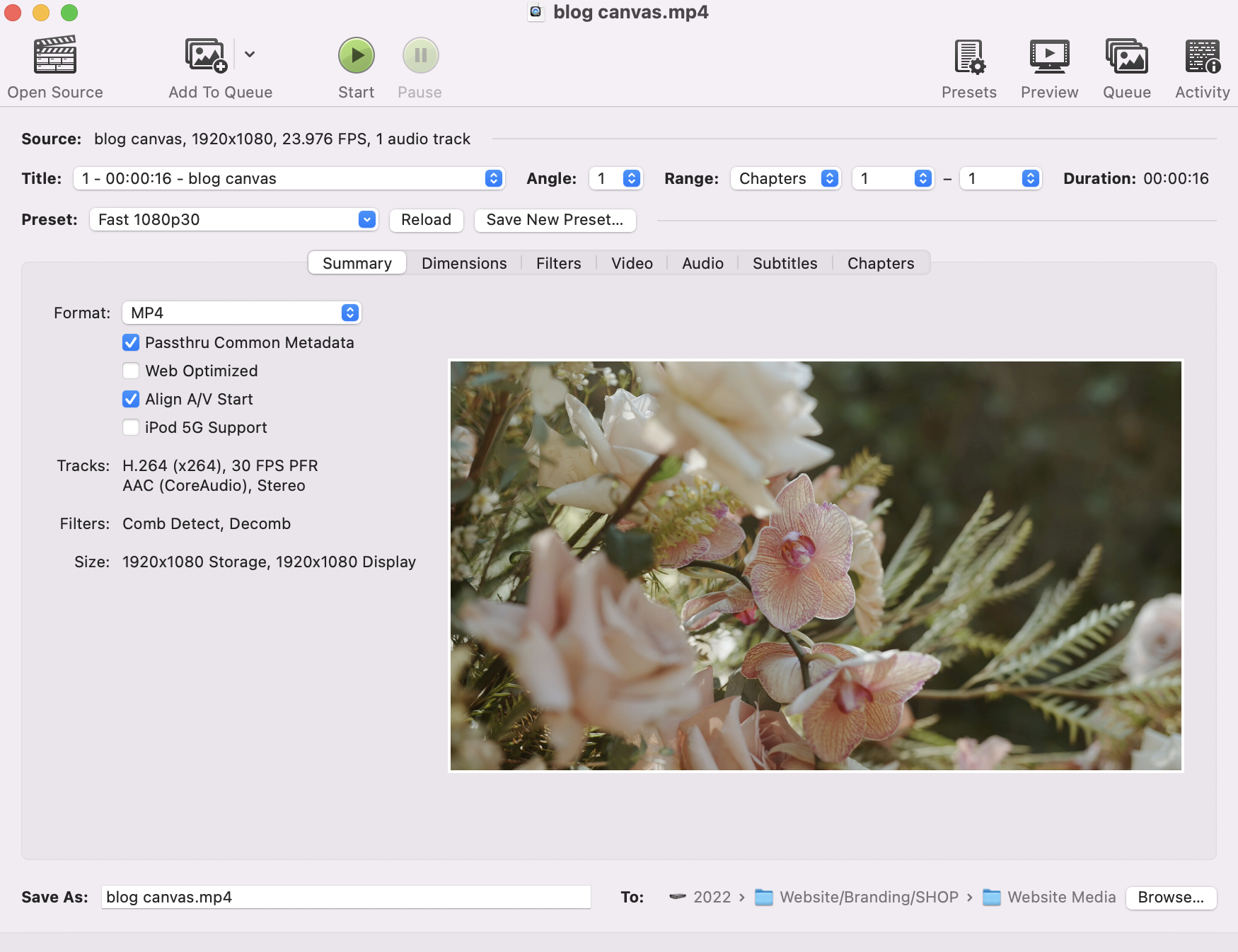
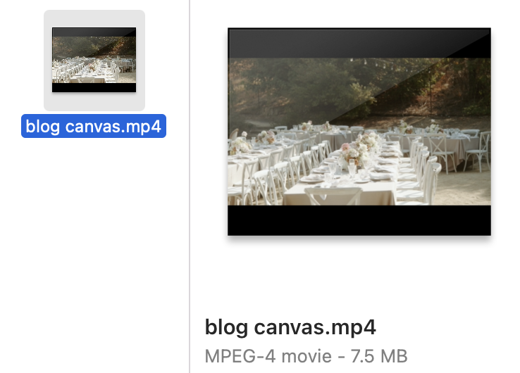
Notice how the video is now 7.5MB!
Finally, upload your compressed video to your Showit’s media library like so.

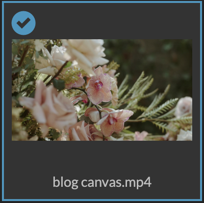
From here, you’ll be able to drag and drop the video anywhere on the page or use it as a canvas background. Note that on the mobile version, .mp4 videos used as canvas backgrounds will need a fallback image. The only way around this is to turn the video into a .GIF and use the .GIF version of the video as your fallback image.
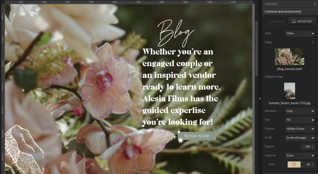
Personally, I like it as a full Canvas background. To make a video as your canvas background in Showit, simply click the canvas and select the “Canvas Background” button from the right side menu. Change your fallback image (for your mobile version) and video settings to what you prefer. Here is a screenshot of my preferences.
How to strategically display short videos on your website
I’ve noticed that a lot of wedding videographers have video canvases like this on their main home page. I would love to have something similar… once I have the right clip that shows off my ideal client and brand within 10 seconds (lol). For now, I wanted at least one of the top hero canvases of my website to be a high resolution video showing off my ideal client’s wedding design. And I strategically chose my Blog page to be the page to have this since my blogs feature my ideal client weddings.
Other ideas to put short videos:
- A BTS video of you next to an ‘About Me’ paragraph.
- A short video of your couple popping champagne next to your contact form.
- A short video of your hometown to say where you’re located.
- A short video of a destination to share that you travel!
How to add long videos to your Showit website
If you’re a wedding videographer like me, you’ll want a place to show off your wedding films. Showit makes this super simple by allowing you to embed your video through a URL. If you normally post your full length films on Vimeo or Youtube, you can simply copy and past the URL into the embed form on your Showit website.
How to strategically display full length wedding films
I encourage you to give your website an entire tab for your portfolio. Potential couples are going to want to watch your work and to easily find this, I would make it a link in your top header. Some people call this page Portfolio. Others just simply call it Films, Featured Films, My Work, or Videos.
And just like every social media – you need to give these videos a title and a caption. On my website, I give all of my featured films a title and short description. This way, when I get on the discovery calls, we can talk about which ones they watched without having to describe the video and guess.
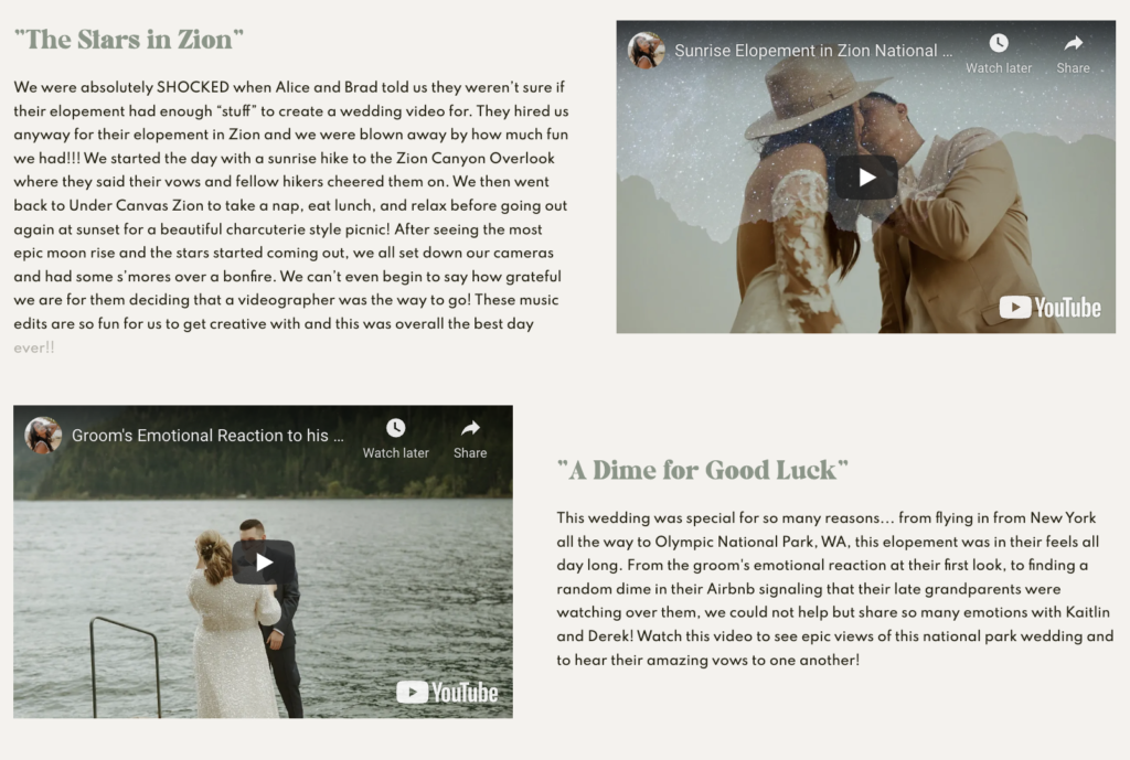
I suggest displaying anywhere from 3-10 full length wedding films on this page. My biggest tip is to ONLY display the videos you want to do more of. For example, I wouldn’t display the Alaska Helicopter Elopement film if I didn’t want to go back to Alaska. I want my ideal clients to watch these films and see themselves in them. Especially the couples that want destinations and candid storytelling. It’ll instantly make that connection and make them want to reach out to me. That is the whole goal.
Other places to put full length films would be next to your contact form. This is to make sure that anyone filling out your website’s form is at least given the opportunity to see your work before inquiring so they align with your brand. Most will skip through a website so fast, they’ll skip right over the films tab. Therefore, putting it in an accessible spot next to your form would make it easy for them.
Another place is your home page. I had this fun idea to turn one of my canvases into a most recent work kind of spot. I put fun text and design around the video and I had it say “Our latest newlyweds” so it matched my brand. Since then, I’ve gotten a lot of positive feedback from it. This tells my couples that I am a very active business owner and my website is up to date with my work. Of course, you can think of something similar without copying this word for word. I encourage you to have at least one wedding video on your home page!
Final Thoughts on adding video content to your Showit Website
I think it’s important to note before moving forward that a GIF, short video or long video is all considered a moving element. You don’t want to make your website TOO video heavy. I know I’m not a website designer. But as a fellow creative who specializes in a very niche’d art… I think it’s important to design your website in a way that flows really easily, is optimized best for SEO, and is fun/engaging for visitors. Video content can really help people stay on your website. But more importantly, it encourages the lead to hire you. Be forewarned though, if there’s too much of it, it could also slow down your pages or be too much stimulation. Keep that in mind as you build your website, or give your notes to your web designer.
Looking for more useful education like this?! Keep exploring the Blog to level up your business or reach out to Alesia here for a 1:1 mentorship call!